Monday, July 2, 2012

VXX AND VIX relationship and calculation

Short TVIX: The Ultimate VIX Contango Trade


Contango is Back
The volatility futures curve is back in strong contango, and with it an opportunity to profit from the short trade on volatility linked ETFs/ETNs. For a primer on this trade, see previous articles here and here, but in short it's an attempt to profit from the bias of investors to believe that market volatility in the future will be greater than it is in the present - essentially a fear of the "unknown unknowns".
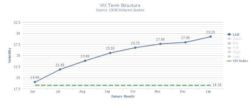
(click to enlarge)
source: VIXCentral.com
Current contango of 15% (as of 6/18/12) is very steep even by standards of the VIX futures curve norms, and is steeper than it has been at any point since March 2012 and before that in April of 2011. There are many reasons to be uncertain about risk in the markets at current, but it's questionable at best to believe that there will be more reasons to be concerned in August than in July, which is what futures traders are expressing.
A Better Way to Play
In the past, I have advocated the use of short (VXX) or long (XIV) as ways to profit from steep contango, but there is, in my opinion, a more compelling way to profit from contango, short (TVIX).
is a 2x leveraged version of the VXX which should, in theory, return 2x the daily gains or losses of VXX or similarly structured funds.
However, as many have observed the TVIX had a pretty wild ride this spring. For those not familiar with the fund, in February the fund's sponsor Credit Suisse temporarily halted creation of new units of the fund in response to skyrocketing demand and ballooning risk exposure for CS. Halting the issuance of new shares broke the mechanism that tends to keep funds trading in line with underlying value, and in a tulip mania moment, the market bid the price up to an 89% premium to fair value in just a few weeks. About a month later, when the sponsor resumed issuing shares on a limited basis, shares traded down sharply and more in line with fair value
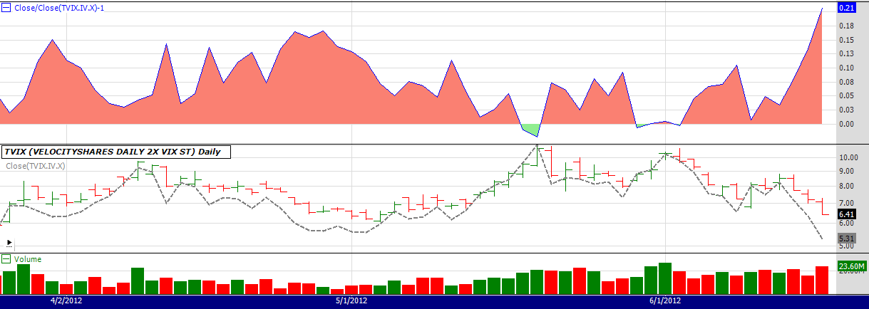
However, "more in line" is not the same as "in line". In the approximately three months since CS resumed share issuance, the relative premium (discount) to fair value of TVIX trading has ranged from a 17% premium to a 2% discount vs. net asset value so the current +21% is outside the high end of that range. The below chart illustrates the premium to fair value since late March.
(click to enlarge)
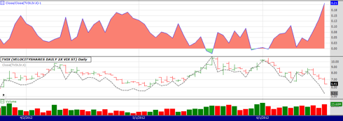
It's worth noting that the compression of premium has tended to happen by the mechanism of TVIX market price rising much less than would be implied by changes in the underlying value, rather than any outright selling off. For instance, in the period from May 10th to May 18th, when the underlying index that TVIX is based on rose by 79% the share price rose only 57% and the 12% premium vanished. Similarly on May 30th when the underlying index rose 21% in one day the TVIX rose only 10%. By way of analogy, the casino has started paying blackjacks at 6:5 instead of 3:2. You can still profit from the long side, just like a lucky blackjack player can make money on a blackjack table that pays 6:5, but the smart player stays away.
Catalyst for Change
It seems reasonable that the current regime of 5-15% premiums will continue until either (1) leveraged ETF speculators become rational, or (2) Credit Suisse fully opens the window to "authorized participants" that are able to buy shares at net asset value and sell at market price, for a fast and virtually risk free profit. Since I have zero expectation of the former, the reversion trade hinges largely on timing of the latter.
Specialists/authorized participants would jump at the chance to buy at indicative value and sell at market, so the key decision-maker here is the risk management folks at Credit Suisse that decided to tap the brakes back in February as they watched their market exposure grow exponentially.
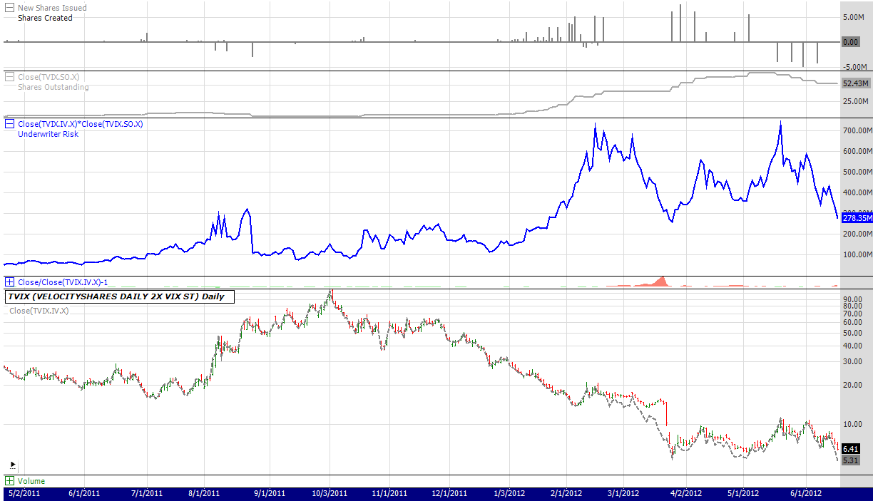
The below chart shows the total potential market exposure for CS to the TVIX, assuming they are not hedging away any of their risk by trading on the futures market (if they're hedging, it would be less than shown). Prior to February 2012, CS exposure to the TVIX remained between $100M and $300M, as calculated from:
number of shares outstanding * indicative asset value
(click to enlarge)
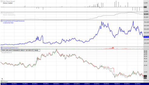
Note that the current market exposure of $278M (52.4M shares at $5.31 each) takes risk back to where it was in late January, before the trip to crazy-town that spooked the risk management folks. If the short term volatility index on which TVIX is based continues to fall, this number will get lower and we may see further share creation that leads to selling pressure as the lucky specialists cash in their golden ticket.
Warning - Not a Risk Free Arbitrage
It's worth reiterating that the short TVIX trade is not a risk free arbitrage, simply a favorable risk/reward tradeoff. If volatility does spike as it most certainly can do, TVIX will spike as well - and the rising value of the CS exposure would make new share creation less likely. If it falls, however, longs in the fund may become impatient, and Credit Suisse may become bolder about putting more shares on the market.
Anyone taking a position would be wise to recognize that this is a leveraged ETN tracking volatility which is traded by irrational speculators and size positions accordingly.
Disclosure: I am short TVIX.

Tuesday, June 26, 2012

One thing common in all good stocks

All the stocks that went up including Apple, Autozone, Ross, dollar tree, Master card, visa, discover card, etc...the earning per share,EPS is high.

These were good stocks to buy and leave for 1 year and one would see 50 to 100 profit margin. The basic buffet rules to buy stocks.


Friday, June 15, 2012

POKER lessons

On big pots if you do not have the best just let it go. this is the one skill which is so hard to learn but that is the key. This is the master skill. For example I had a pocket AA and the flop came 8 hearts, 7 clubs and 9 hearts. The other guy when all in. I had 250 dollars. I knew it was a open ended straight and a flush possibility. But the gambling instinct took the upper hand. I went all in and there was a flush on the turn.....The point is was it necessary to take that kind of risk. the master skill was to lay down the pock AA. If I did that I would be a master.

The big pocket pairs are the most difficult cards to play. One way to play them is to go like 50 dollars or more on preflop or go with a small raise like 15 to 20 dollars then when the flop comes just be ready to let go if there is a straight or flush possiblity. These are the only two ways to play these pocket pairs. And it is better not to go all in on small pocket pairs.  It is too much gambling and losing all the chips should not be the plan.


Wednesday, May 2, 2012

Good stocks doubled but......

Stocks of good companies with increasing revenues and profits like Apple, master card, priceline and dollar tree have doubled from 1 to 1 and 1/2 year.

They do not grow in a single day or a even a month. It takes atleast 6 months to 1 year to see that gain.  I knew Dollar tree was good from the graph but could not hold it.

One has to believe that the stock price will go up after studying the upward graph. Hmmm. Hard to hold especially when one has a margin account. All trouble because of margin account. Holding is impossible with margin account.
Investing is not easy especially for people who start with less money since we are looking to double our money too  fast and not holding.

sharebuilder would have been a good option. Just buying the growth companies.

Hmmm...should aaa...could aaaa...

What about the future??? Am I going to do the same mistakes with margin account or invest in good growth stocks and leave the share price to grow???? One has to believe and leave or atleast keep a stop loss and leave the stock to grow....


Monday, March 19, 2012

The question of housing affordability – 17 US markets near potential price bottoms. Two are in Southern California. Southern California also has counties where mid-tier cities are overpriced and continue to correct.

http://www.doctorhousingbubble.com/housing-affordability-17-us-markets-near-potential-price-bottoms-socal-midtier-housing-real-estate-prices/


Housing affordability matters.  One of the biggest line items used to qualify home buyers is yourhousehold income.  This is why it is hard to understand why some people simply choose to ignore the most important factor in sustaining housing markets.  Household income drives rental prices and also drives household values historically.  Should these ratios get out of whack because of exotic mortgages or imprudent lending then prices will rise but as we are seeing, will adjust lower back to more historical trends once the unsustainable trend pops.  Some arguments hold very little water in the current landscape.  Many markets in the US may be near market bottoms and we will highlight 17 of them.  They all have very similar characteristics and some are here in California.  Other areas are still over priced by historical measures.  Let us examine the markets where price bottoms may have been reached.
17 US markets with potential bottoms
In many markets of the US if you have a solid job buying a house looks to be a good financial move.  Yet some people are so niche focus that they forget that the US is much bigger than say Culver City orBurbank.  Some may argue that lower interest rates may change the equation but keep in mind low rates apply to the entire country so wouldn’t these income to home price metrics adjust everywhere thus pushing prices up evenly?  Of course but this is why some markets may be stabilizing while mid-tier markets in Southern California fell over 5 percent in 2011.  Let us take a look at a wide range of markets where home prices may be reaching bottoms:

The list varies across the country.  I’ve included a handful of California markets as well.  In these areas if you have secure employment and would like to settle down, there is likely to be very little reason not to buy.  This isn’t a question of being a bear or a bull.  It is a question about understanding home values in a historical and local context.
Home price to area income ratios absolutely matter.  You’ll notice one key element here as well.  Even with low interest rates a historical home price to income ratio holds steady.  Each one of the affordable markets above has a home price to median household income ratio ranging from 2.43 in Bakersfield California to 3.15 in the San Bernardino and Riverside markets here in Southern California.  You mean we have some affordable homes here in SoCal?  Absolutely.  In these markets buying makes sense if:
-You have secure employment
-Plan to stay long-term (i.e., 7 years or more)
The cross section above is extremely diverse.  You have markets in areas like McAllen and Fort Worth Texas that had almost no bubble even during the craziness of the housing mania.  Then you have markets like Pensacola Florida and Merced California that have collapsed so bad that home values are coming back in line with local area incomes.

Where the bubble still roams
The above list includes 11 states and we can include many more as well.  The nationwide median home price is close to $150,000 so in many areas, home prices are looking attractive.  Los Angeles and Orange counties are not two of those areas.
The Los Angeles Case-Shiller data includes Orange County.  For the year of 2011 prices continued to move down in these markets:
LA-Case-Shiller-Tiers-Zoom_2011-12
December 2011 (latest data)
Month to Month: Down 1.1%
Year to Year: Down 5.2%
Prices at this level in: August 2003
Peak month: September 2006
Change from Peak: Down 40.8% in 63 months
Low Tier: Under $289,982
Mid Tier: $289,982 to $474,017
Hi Tier: Over $474,017

If home prices were viewed as cheap don’t you think sales across the state would be soaring?
home sales california 2012
So why are prices still inflated in these markets?  Let us go back to 2000 when the bubble was already starting and look at three California counties:
socal three counties income and home prices 2000
I would argue that the housing bubble in Southern California started in the late 1990s but we’ll be conservative and use 2000 as our baseline.  When we look at the metrics above a ratio of 4 seems to hold for home price and income.  So compared to our affordable list above, this translates to one more year of household income tacked on to the median home price.  As we stated before, low interest rates help the entire nation so why is it that the majority of markets across the country still maintain stable ratios even today while these markets remain inflated?  The fact that home prices in mid-tier regions fell over 5 percent in 2011 tells you that yes, home prices in relation to incomes do matter and that is why prices continue to fall.
Home prices in these markets today are more inflated than they were in 2000.  If we look at incomes and home prices today versus the baseline of 2000 we realize that these markets have gotten more expensive even with prices of today and slightly higher incomes:
socal three counties income and home prices
Where nationwide it takes roughly 3 years of household income to buy a home, in these three counties in 2000 it took roughly 4 years of household income.  Today it is over 5 years of household income and the economy is doing more poorly than it was in 2000:
California unemployment 2000:                 5 percent
California unemployment 2012:                 10.9 percent
What should you take away from all of this?  Home prices in a large cross section of the country look to be affordable.  Prices in Los Angeles and Orange counties are still inflated.  For home prices in these regions to get back even to their 2000 ratios, prices would need to adjust lower by:
To reach 2000 ratios
Los Angeles:                       -$78,264
Orange County:                                -$108,480
San Diego County:           -$65,308
Since most first time home buyers are going in with 3.5 percent FHA insured loans, the above gap is likely to wipe out any down payment.  To buy in these counties a tiny amount is needed:
FHA 3.5 percent down payment
Los Angeles:                       $10,115
Orange County:                                $13,720
San Diego:                           $10,675
Yet some want to get the green light to buy.  Look, if you have an absolute need to buy and your life is completely unfulfilled until you buy in one of these mid-tier markets, go ahead.  No one is stopping you.  In fact, the banking controlled government wants you to overpay.  But if you look at this from a purely investment perspective, many other US markets do make sense on every front.  For Los Angeles and Orange County mid-tier markets they do not.


Monday, January 9, 2012

Condo market pricing

http://www.housingviews.com/2012/01/04/condo-prices-largely-weaken-in-october/


October 2011 data for the S&P/Case-Shiller Home Price Indices were released on Tuesday December 27th, revealing monthly declines in condo prices in four of the metro areas – Boston, Chicago, Los Angeles and San Francisco. The San Francisco index reported the largest decline, down 2.6%; in October versus September, but Chicago was close behind, down 2.5%.  The LA condo index fell by 1.7% and the Boston index by 1.6%. Condo prices in New York rose marginally, by 0.1%, in October, their fifth consecutive monthly increase, and are showing positive annual rates of change, up 0.5%.
With October’s report, Los Angeles condo prices have fallen 15 consecutive months. The index was down 8.2% in October 2011 versus October 2010, which is worst annual rate of the five markets covered by our indices, and hit a new crisis low in October 2011. San Francisco’s condo market is now down six consecutive months and also posted a new crisis low in October. Average condo prices in San Francisco are down 8.0% versus October 2010. Chicago prices are down 7.7%.
The chart below compares the index levels for the five condo markets covered by the indices, rebased to 1995 = 100. The blue and red lines represent Los Angeles and San Francisco, respectively, where you can see the 15 month declining trend continued for these two markets in October. On average Los Angeles condo market prices are back to their mid-2003 levels; while San Francisco prices are back to mid-2002 levels.
S&P/Case-Shiller Condo Price Indices. Sources: S&P Indices and Fiserv.

On a relative basis the New York condo market is the most stable, as the table below highlights. New York condo prices were the only ones up on both a monthly and an annual basis in October.
The chart below illustrates the differences between New York, Los Angeles and Sand Francisco over almost 12 years. The green line clearly shows the New York condo market is the best relative performer coming out of the recent crisis.  Condo prices are still up over 102% versus January 2000.  By comparing the green, grey and orange lines, you can see that the New York condo market has been fairly stable over the past three years and has been on an upward trend since January 2011; whereas the California markets continue to weaken. The LA condo market has fallen by 40.8% since its July 2006 peak; the San Francisco market has fallen by 35.6% since its October 2005 peak; but the New York market has only fallen by 12.8% from its February 2006 peak.
S&P/Case-Shiller Home and Condo Price Indices. Sources: S&P Indices and Fiserv